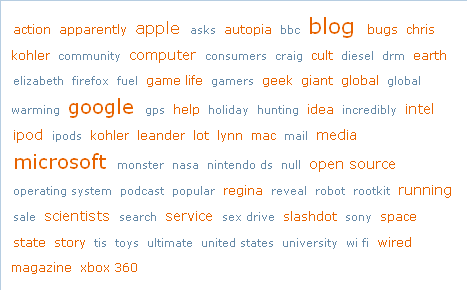
Something that’s mystified me of late is the popularity of tag clouds. Why do people like them? Don’t they realize they’re ugly? Or perhaps no one really likes them, everyone just thinks someone else likes them.
Let’s take an example tag cloud, a strange mishmash of oddly-sized words that look like a 12-year old just discovered the HTML font tag:

What is this trying to say? Someone looking at this for the first time would have no clue why some of these words are bigger than others and why they’re in alphabetical order. Instead, let’s try something like this:
- microsoft
- blog
- apple
- open source
- scientists
- intel
etc..
That’s pretty clear that this is a list of popular terms and they even line up nicely. Boring? Maybe. But I’ll take clarity over silly design fads anyday.
I like tag clouds because they expose a broader array of information than simple lists. Plus, you get two ways of looking at the info with one view (alphabetical and popularity). I find this easier to parse, in a gestalt emergence sorta way. It also feels more serendipitous than a simple ranked list.
BTW, I don’t like how your blog posting form blows away your typed comments if you forget to type Jeff, get the error, then hit back.
Interesting. I’ve always hated tag clouds and thought that everyone else love them and I just disliked them because I wasn’t Web 2.0 enough. Nice to know I’m not alone.
I like tag clouds maybe because I do like the latest design trends. They visually do convey more information than just a simple list and they are more compact then a simple list.
I’ve looked at clouds from both sides now,
Both win and lose and still some how,
It’s clouds’ illusions I recall.
I really don’t know clouds at all.